Pursuit
January 2013
Collating & promoting the research discoveries and public engagement activities from Australia's most prestigious university, Pursuit is a project that I conceived, ideated, advocated for and launched.
The challenge
Universities generate knowledge.
A challenge many of them face is that much of this knowledge is either too detailed for the general public to understand or the only published in academic journals which most people have no access to.
This contributes to two negative outcomes for Universities:
- The public is unaware of all the fantastic work being done and can’t learn from it.
- The public does not understand the value provided by Universities research (often completed using tax dollars) making it easier to reduce University government funding.
At some point, if Universities are to communicate to the public what they are researching then they need to find a way to disseminate this activity and knowledge.
Historically, at the University of Melbourne this meant that dozens of small websites were created, each trying to do a small piece of the work of communicating research news and discoveries to the public.
Predominantly ineffectual and invisible through the massive complexities of University websites, this content languished and largely failed to explain the research mission of the University to the public.
The Solution
As part of my work on a new Web Strategy for the University of Melbourne, I architected an ambitious approach to create a series of platforms - each of which would be created to address a major subset of user and business needs. These platforms combined would form a new University web presence. One of these platforms was Pursuit.
My goal for Pursuit was to harness the full breadth of University content by consolidating the best of it into a single new platform and enabling a new generation of highly engaging content to be produced. By creating a single destination for the public to visit individual pieces of content would get more exposure, reach a larger audience and increase the chance that the tempo of content refresh would warrant audience revisitation.
To do this, I needed to:
- architect and design a new platform that focused on giving the public the best possible reading experience
- enable the production and distribution of engaging content from across the university by providing editors with a great platform for entering their content.
- aggregate key sites (blogs, news websites, events) into a single property by appealing to individual university faculties to use this new platform


The Process
The process I went through to create Pursuit was as follows:
Step 1: Idea and an alpha prototype

- Formulated the idea for a single, more effective approach to content creation and distribution across the university.
- Work with Andreas Weis (Creative lead) to develop quick prototypes using Sketch
- Created an Alpha prototype using middleman to demonstrate the idea
- Prototyped an editors interface in Axure
Step 2: Business case and approvals
- Socialised the Alpha with Faculties from across the university to gather feedback and commitment.
- Produced an explanation video to push the idea further across the university (this was received very well) - you can watch it below.
- Develop and present a business case to the Universities’ Senior Executive (C-Suite equivalent) - gained approval to build and use this site as the flagship property for a new University branding campaign focusing on the Collision of ideas.
Step 3: BETA BUILD
- Worked with Technical lead identify development stories
- Continued to test against prototype interfaces against real users to identify areas for improvement pre-development
- Commissioned Icelab to assist with creating the editor interface used to enter content
- Begun development of both public and editor interfaces simultaneously
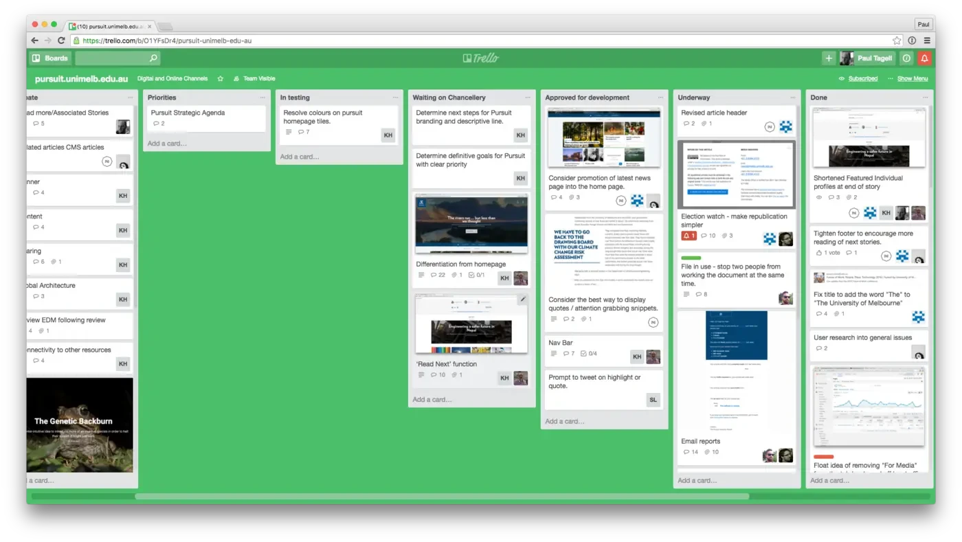
- Managed build process using Trello (Icelab) and Pivotal Tracker (Unimelb team), weekly sprints and daily stand-ups
- Worked with Analytics lead to implement advanced google analytics tracking modifying the use of eCommerce functionality to track readership of a page at a more detailed level.
- Worked with Optimisation lead to ensure that the platform was optimised from a search perspective.
Step 3: Editor Training
- Wrote an online manual for editors of the platform.
- Integrated instructional videos into the editors manual demonstrating how to complete all aspects of Pursuit administration (accomodating multiple permission levels)
- Just prior launch I ran several group and individual training sessions to instruct 40 editors from across the uni in how to use the platform.
- Developed a Trello-based content production calendar to help ensure that the quality of content published onto the platform was high.
Step 4: Itration, maintenance and improvements
- Since launch I have managed a continual stream of feature improvements for editors, stakeholders and the public.
- All ideas are entered into a Trello board and prioritised at monthly sprint meetings
- The initial prototype is still used to evolve the platform, test new feature ideas and demonstrate concepts for improvement. ** Key features added since launch include:
- Improvements to article layouts to drive higher rates of repeat article readership.
- All stakeholders and editors now receive a weekly performance report on a Monday morning outlining how the platform (and their particular articles) have performed the week prior
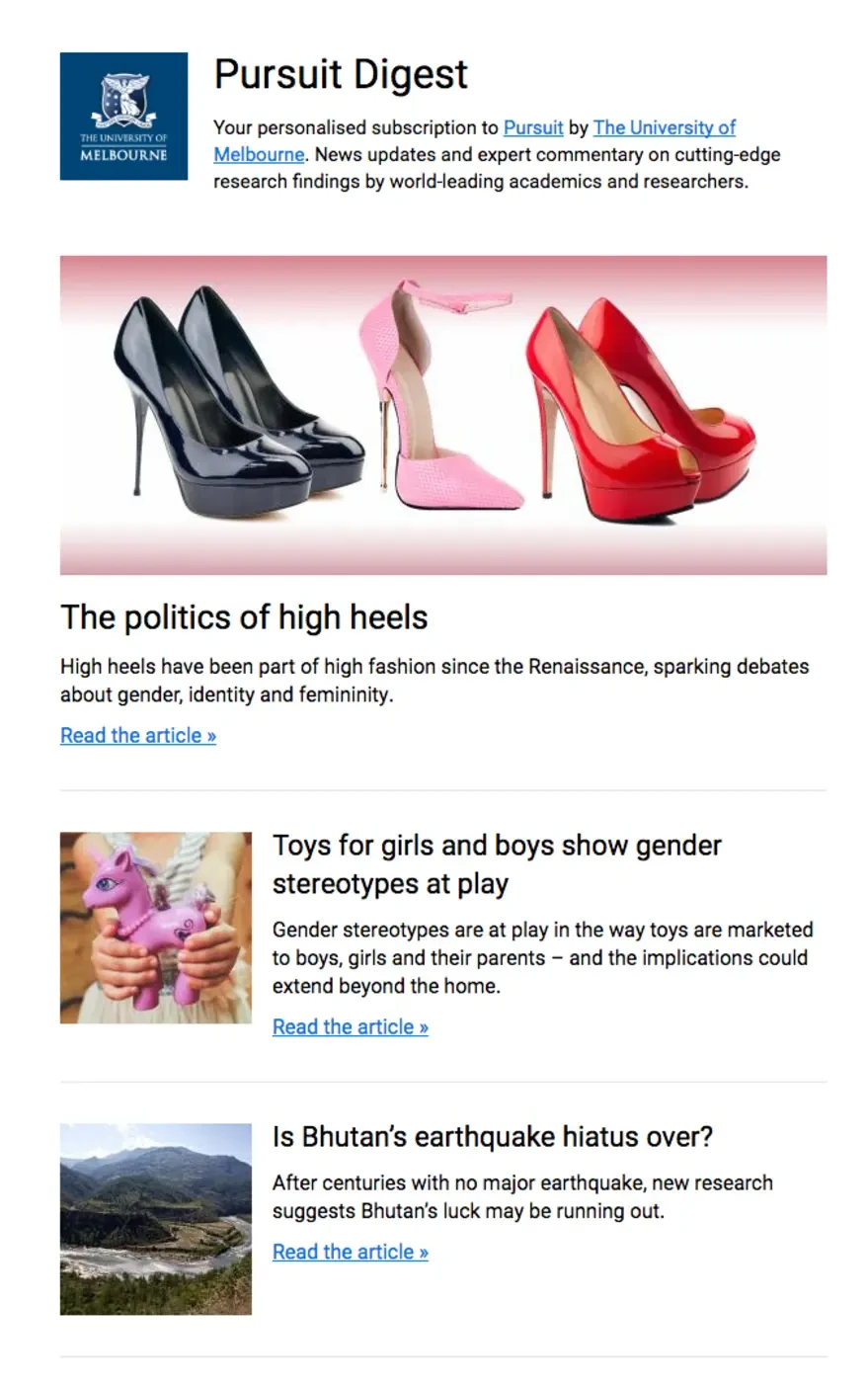
- Major design tweaks to the digest email sent to subscribers to drive higher CTR
- Increased the visibility of subscription prompts to drive higher subscriber counts (without being annoying to users)
- Allowed subscribers to tweak the frequency with which they receive digests (daily, weekly, monthly)
Results
Pursuit has been a resounding success for the university. It is now the primary distribution channel for our research news and discoveries and poised to expand into helping promote our events, lecture recordings and podcasts.
Impressive metrics
In the 6 month period since it launched there were 2,278,489 views from more than 1,573,017 people. Of these, 725,204 views were complete reads of an article. Prior to Pursuit, the largest source of research readership was our newsroom, which garnered only 20,000 views per month.
High degree of user satisfaction
User satisfaction from both public and editors of the platform has been fantastic. During user testing sessions, members of the public remark how clean and readable it is. We have also had editors comment that this is the best CMS they have ever used. They love it's simplicity.
Fulfilling strategic purpose
Drawing back to the original purpose of a platform of Pursuit - to make the public aware of the research completed by the University - independent market research conducted by Sweeney validated the platform by confirming that positively impacted public recognition of The University of Melbourne as a leading research University.

Key features
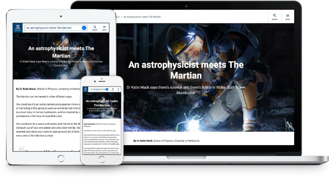
Minimal and focused reading experience
One of the luxuries we had building this site compared to other sites providing news is that we didn’t have to display ads. This meant we made a decision early on to focus on providing the best possible reading experience possible.
Closely-coupled editing interface
One of the most important considerations in creating a publishing platform is creating an editing interface that editors love to use. I invested heavily in creating a medium.com-esque editing interface that editors love to use on a daily basis. They reward this investment by creating beautiful, engaging content.
Channel structure
To entice faculties to publish their content on Pursuit rather than their own news websites, I invented a channel structure whereby they were able to publish their content into their own ‘channel’ of Pursuit but which also facilitated administrators to re-syndicate the best content into ‘Super Channels’ to give it greater amplification. We also made it possible for Faculties to display their content on their own websites via atom feeds.

Machine learning-based article recommendations
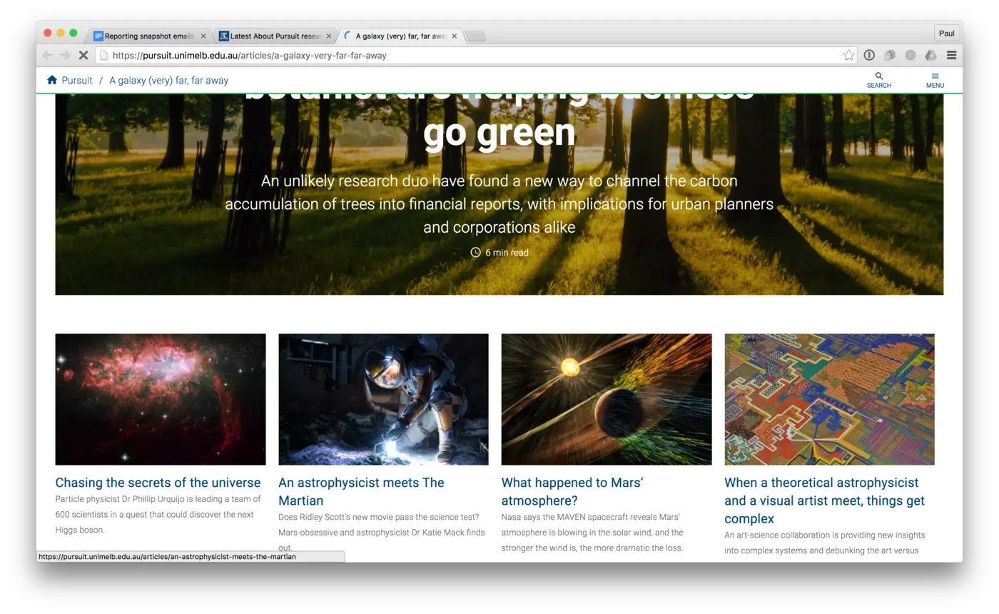
To increase the likelihood of a visitor reading more than one story, we implemented a machine learning algorithm to make article recommendations. These recommendations accommodated your previously read articles, common patterns and contextual matching to make better recommendations
Automated & personalised stakeholder and author reporting emails
Ensuring continued support and raising internal awareness of the work of Pursuit was achieved by creating individualised weekly reporting emails. Integrating the Rails application and Google Analytics, this email sends customised reports to both stakeholders and authors.

Daily/weekly/monthly digest emails
The weekly digest is a key driver for repeat visitation and core focus for the site. With a focus on a seamless sign up process and empowering subscribers to manage their own subscription, the engaging digest sent by Pursuit is a key driver of repeat visitation.
