Unlocking the power of your smart meter data
April 2025
In September 2023, after almost nine years of working towards our goal of electrification, we finally had our gas connection abolished 🎉
As a fully electric house, even with solar panels we were now using more electricity than ever before, so the question quickly became "should we get a battery"?
In trying to answer that rather tricky question (🚨 spoiler alert 🚨: we did get batteries, but more on that in another post), I've stumbled across a few nuggets of pretty widely useful information anyone in Victoria or interstate can make of use of if they have a smart meter.
Understanding these pieces of info can help you:
- visualise your power usage over a day, month, season or year, letting you see when you use and export power. This can be great for seeing the value of changing your power consumption habits
- understand how much power you use and when, which can help you understand if you should get solar panels
- minimise your enviromental impact by using more renewable energy, that you've either generate yourself or purchased from the grid when it's largely being supplied by wind and solar
- build a simulation of your previous usage and solar exports to inform if should get a battery
- understand if you would be better off on a flat-rate, time-of-use tariff or seasonal plan.
But first, what is a smart meter?
To be able to charge you for the power you use, and pay you for the power you send back to the grid, your property will have a power meter. Those power meters have become more intelligent over the last few years and most power distributors in Victoria have an online portal where you can download your meter data. This meter data comes in either a 30 or 5 minute format.
You can find a list of distributors here. Important. A distributor is different from your retailer. If your distributor has one, even logging into your distributor portal can be eye-opening. You can get far far more information than you'd be used to in your monthly or quarterly bill. Often this is also where you can go to sign up for power outage notifications, so it's worth doing!
If, like I was, you're after a bit more than just a single day or months worth of data, you're also able to download your raw metering data in a specific format mandated by the Australian Energy Market Operator. This gives you access to around two years of metering data.
So, you've got your raw data… but what exactly does 5/30 minute metering data mean?
Your smart meter collects information in either 5 minute (more recently) or 30 minute (older) increments telling how much you've used or exported back to the grid in that period of time.
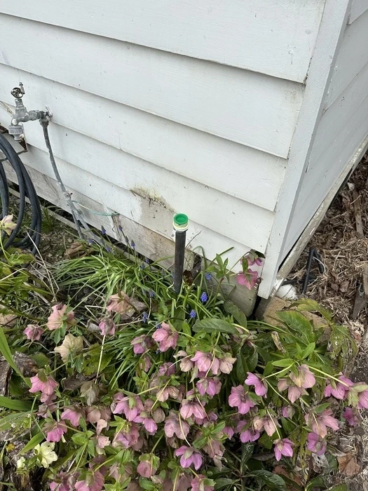
When you first open one of these usage CSV from your distributor, you're confronted with a super intimidating wall o' text. The wall o' text has very few labels and no explanations, but each cell will be your 30 minute or 5 minute usage data in kWh.
If you don't have solar, adding all a row of cells together will be how much power you've used in a day. Taking this data and grouping it by half-hour periods is a great way to visualise your power usage.
This file also includes data about any controlled load circuits you might have as well as your solar export data.
If you do have solar, figuring out your usage is more complicated because some of the numbers in your file will be export amounts. A portion of your overall power use will be power you've made through solar panels, but consumed before it's been exported (this is called behind the meter usage or self-consumption). That doesn't mean this data is useless to you though…there are some nifty opportunities hidden inside it which I'll explain later.
This raw data, however, becomes much more powerful when visualised.
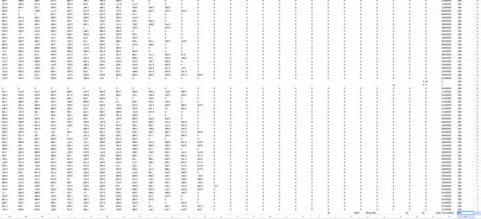
One of the most useful things you can do with the data available in these files is to create a heatmap visualisation of your historical energy use that that helps you understand when you consume power across a longer stretch of time.
Being able to see this helps you understand a fair chunk about the patterns of your energy use.
- Do you buy most of your power in the evenings or during the day?
- Do you use more power on a winters day than on a summers day?
- Is there energy usage at a time of day you don't expect (vampire energy use for example)?
- Are you using lots of power when you pay more for it thanks to a peak/off-peak tariff plan?
- Can you change your habits to use cheaper or more renewably generated power during the middle of day?
What does this look like? For me, across 24 hours of the day my usage looks like what you can see below. Redder colors indicate higher consumption.
You may notice our household usage looks a little odd in that it bottoms out in the middle of the day a lot of the time. That's because we have solar and during the middle of the day, solar is pumping and a lot of the solar produced is self-consumed.
Let's have a look at what a few alternative use patterns could mean.
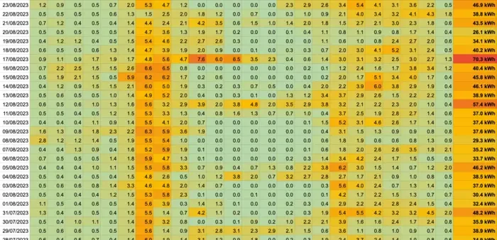
Heavy use during the day.
If your usage looked something like this and you didn't have solar, chances are that you'd benefit from getting an array because it'd knock out a chunk of your daytime grid usage.
Heavy use in the mornings and evenings.
If your usage looked something like this most of the time, you're probably living in a household where there's not much going on during the day so power use is low at those times. People get up and get ready, then head off for work, then return in the evening for dinner and bed. Either that, or your daily routine sees you heating, cooling, cooking and cleaning using power in the mornings and evenings. If that's you and you wanted to get benefit from solar, you might want to look at seeing if you could modify your habits to establish a usage pattern more like the first example.
If you do get solar without changing these habits, consider trying to get some facing east and west to soak up the early morning and late afternoon sun (which is when you'll be able to make the most of that solar).
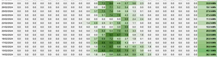
Heavy morning and day use, low evening use.
If your usage tends towards the morning and middle of the day, potentially you might benefit from a Time of Use tariff power plan that charges you less for using power outside of the peak evening times (peak periods are 3-9pm for our current retailer (OVO)).
That's nice and all, but how can I get this sort of visualisation for myself?
After going down this rabbit hole and building the proof of concept you can see above, I actually went down a much deeper hole and built a website called Electrify and Save. Just by uploading your NEM12 file, you'll get far better visualisations of your power use over time that I managed above and will be able to understand your power use seasonally, monthly, or even per day if you want. It's totally free to visualise your data, so give it a crack!
Oh, and there's a side benefit to doing this data analysis. Using your meter data, it's possible to work out, very accurately, which electricity plan (out of the ~10,000 available today) would most suit you if you were to swap plans.
Ready to see your own energy usage in this insightful way? Head over to Electrify and Save and turn your boring data into useful insight for free!